Case study · 2025
Catalyst for Consensus.
Three logo directions for a brand that brings people together.
- Client
- Catalyst for Consensus
- Year
- 2025
- Sector
- Mediation · Civic engagement
- Scope
- Brand exploration · Logo options · Merch mockups
The brief
Catalyst for Consensus needed an identity that signaled mediation, balance, and forward motion. We developed a single brand system anchored by two confident Pantones and a clean Proxima Nova typographic voice, then explored three distinct logo directions—each carried through to merch mockups so the team could feel how the mark lives in the world.
01
Brand system
Two Pantones. One confident voice.
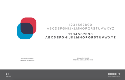
02
Brand colors
Red for energy. Cyan for clarity.
Catalyst Red
Energy & decisiveness
- HEX
- C8102E
- PMS
- PMS 192 C
Catalyst Cyan
Clarity & trust
- HEX
- 009CDE
- PMS
- PMS 801 C
Catalyst Ink
Grounding contrast
- HEX
- 1F2A3C
- PMS
- Neutral
Proxima Nova Bold
Display & wordmark
Proxima Nova Light
Body & long-form
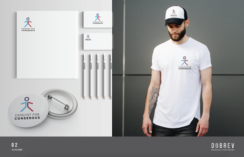
03
Logo direction · option 01
The Walker
Two figures stepping forward as one — a literal catalyst between perspectives.
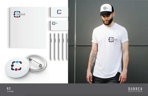
04
Logo direction · option 02
The Convergence
Four brackets and two dots meeting in the middle — opposing parties pulled into agreement.
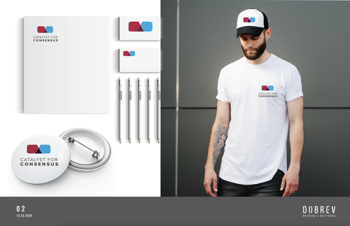
05
Logo direction · option 03
The Overlap
Two rounded shapes overlapping into a third — common ground made visible.
Deliverables
- Brand strategy & positioning
- Color & typography system
- Three logo directions
- Merch mockup suites
- Stationery & business cards
- Apparel & button visualizations
"Three directions, one brand system — so the client could feel the mark before committing to it."