Case study · 2018
Kehribar Hookah Lounge.
An amber-lit identity shaped from geometric harmony.
- Client
- Kehribar Hookah Lounge
- Year
- 2018
- Sector
- Hookah lounge · Hospitality
- Scope
- Brand identity · Brand book · Web · Collateral
The brief
Kehribar needed a brand world that felt refined, atmospheric, and unmistakably its own. The work started with an eight-fold geometric mark inspired by symmetry and overlap, then expanded into a full hospitality system across digital, print, and in-space touchpoints.
01
Logo construction
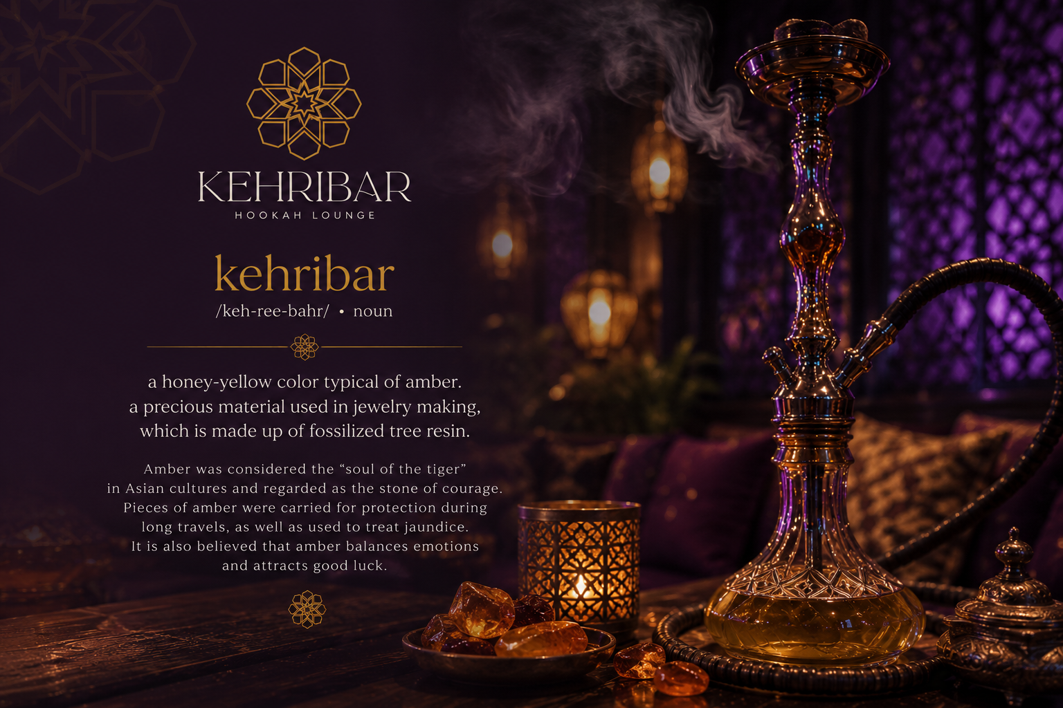
Eight-fold symmetry, drawn with intent.
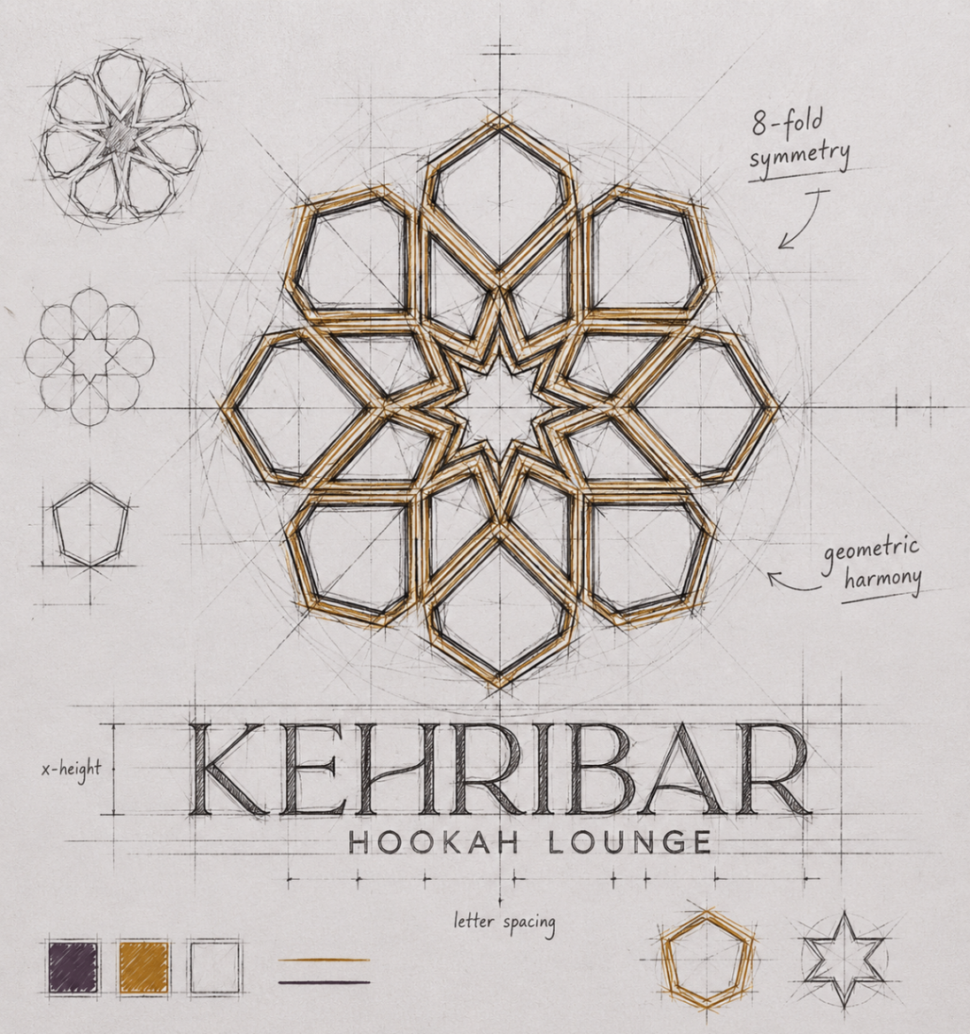
The identity balances modern elegance with the warmth of amber light. Deep plum grounds the brand, gold lines bring precision and luxury, and every application—from the website to menus and coasters—extends the same sense of ritual, richness, and quiet confidence.
02
Brand palette
Deep plum, soft gold, vivid accents.
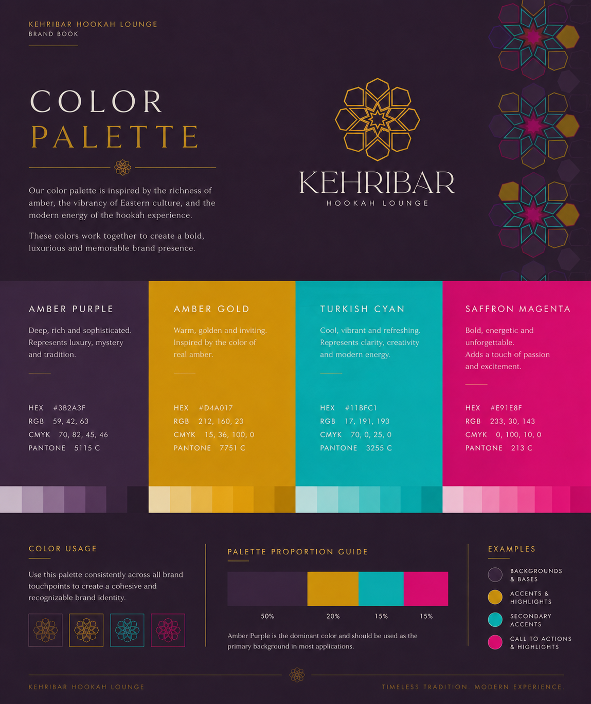
Amber Purple
Primary background tone
#3B2A3F
Amber Gold
Accent and highlight
#D4A017
Turkish Cyan
Secondary accent
#11BFC1
Saffron Magenta
Expressive highlight
#E91E8F
03
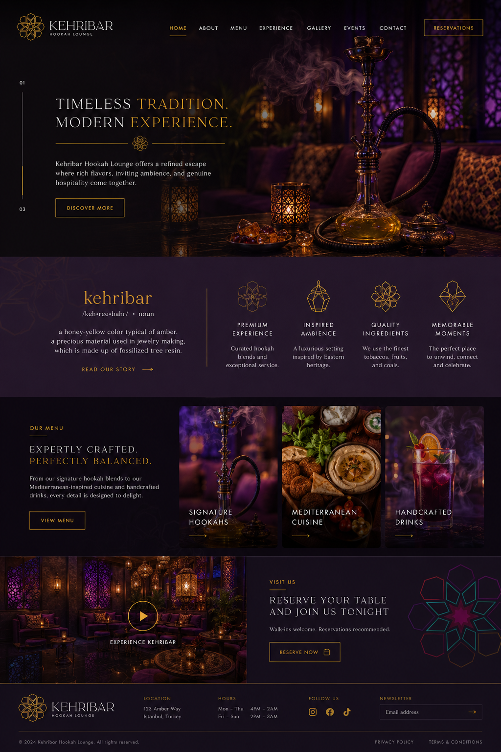
Digital expression
A hospitality website with atmosphere.
04
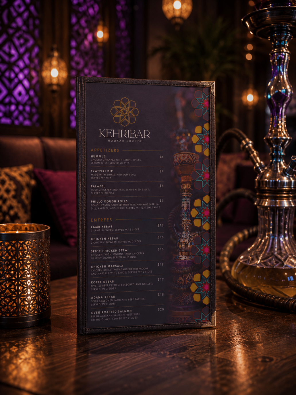
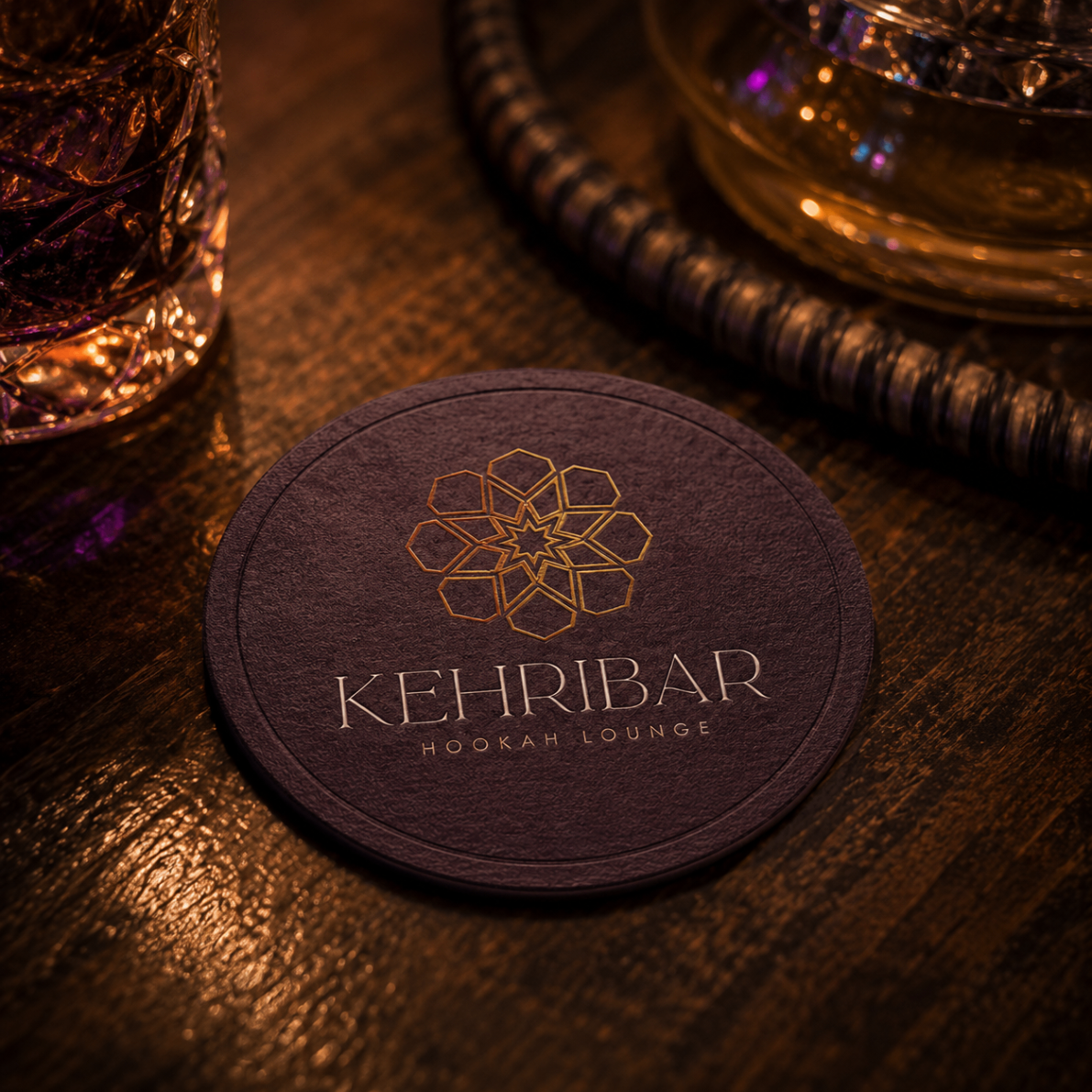
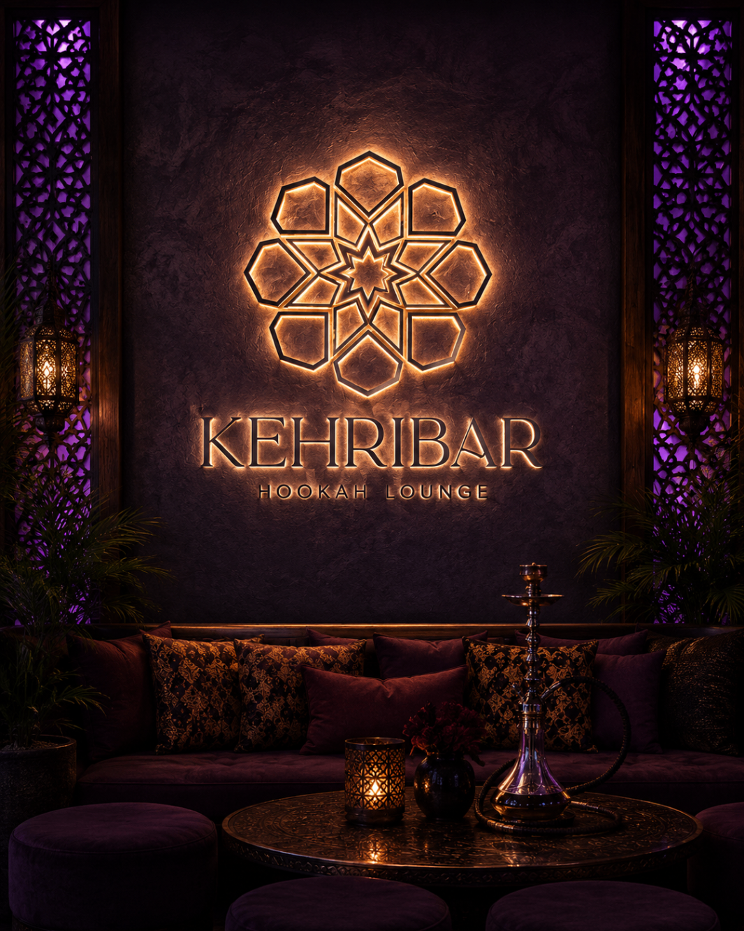
Brand in the room
Menus, coasters, and signage that carry the same ritual.
Deliverables
- Logo concept & geometric construction
- Primary mark and wordmark system
- Color palette and brand book
- Website design direction
- Menu and tabletop collateral
- In-space signage visualization