Case study · 2024
The Nesting Nook.
A cozy place to land, unwind, and make yourself at home.
- Client
- The Nesting Nook
- Year
- 2024
- Sector
- Short-term rental · Hospitality
- Scope
- Brand identity · Website · Patterns · Collateral
The brief
The Nesting Nook is a thoughtfully styled short-term rental in Smyrna, GA, designed for families, friends, and travelers near Atlanta. We built a warm, playful brand world — a hand-drawn rowhouse mark, a sun-and-strawberry palette, and a layered pattern system — that makes guests feel welcomed from the listing photo to the front door.
01
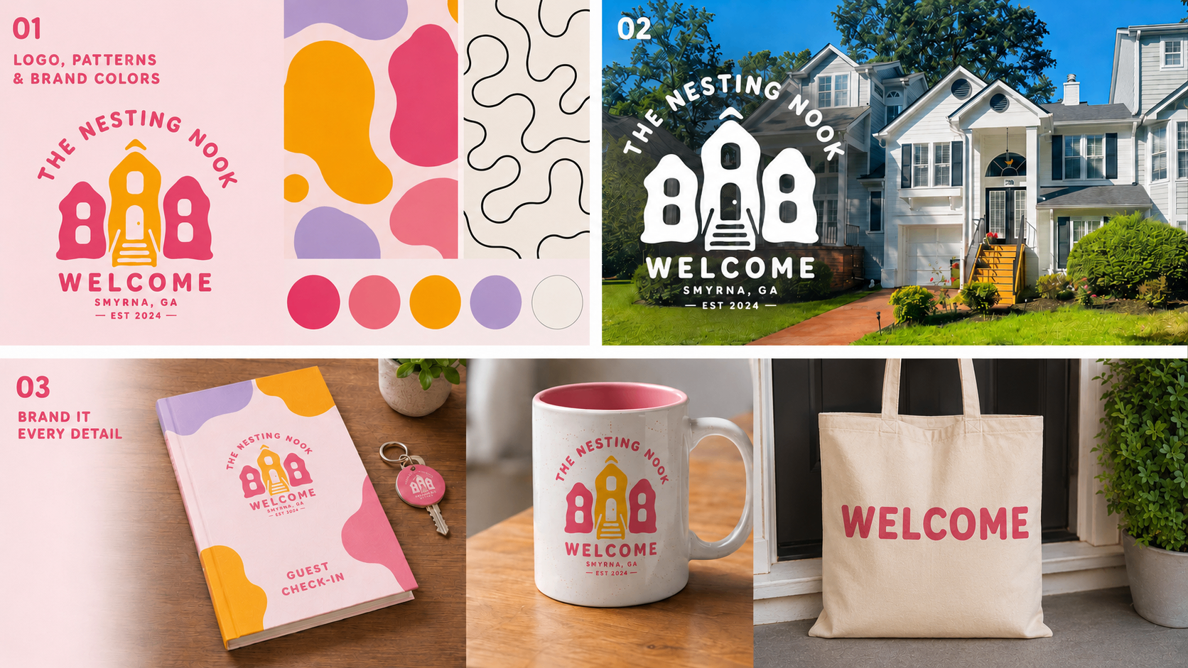
Identity system
A hand-drawn rowhouse mark that feels like home before you arrive.
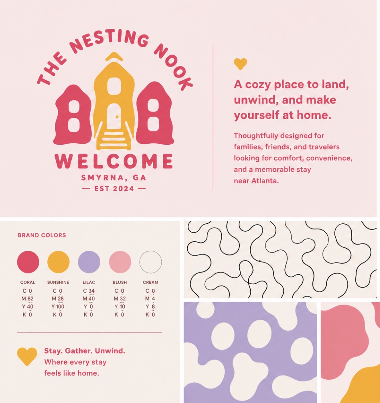
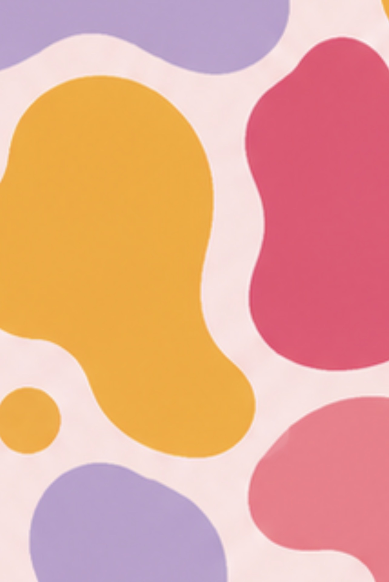
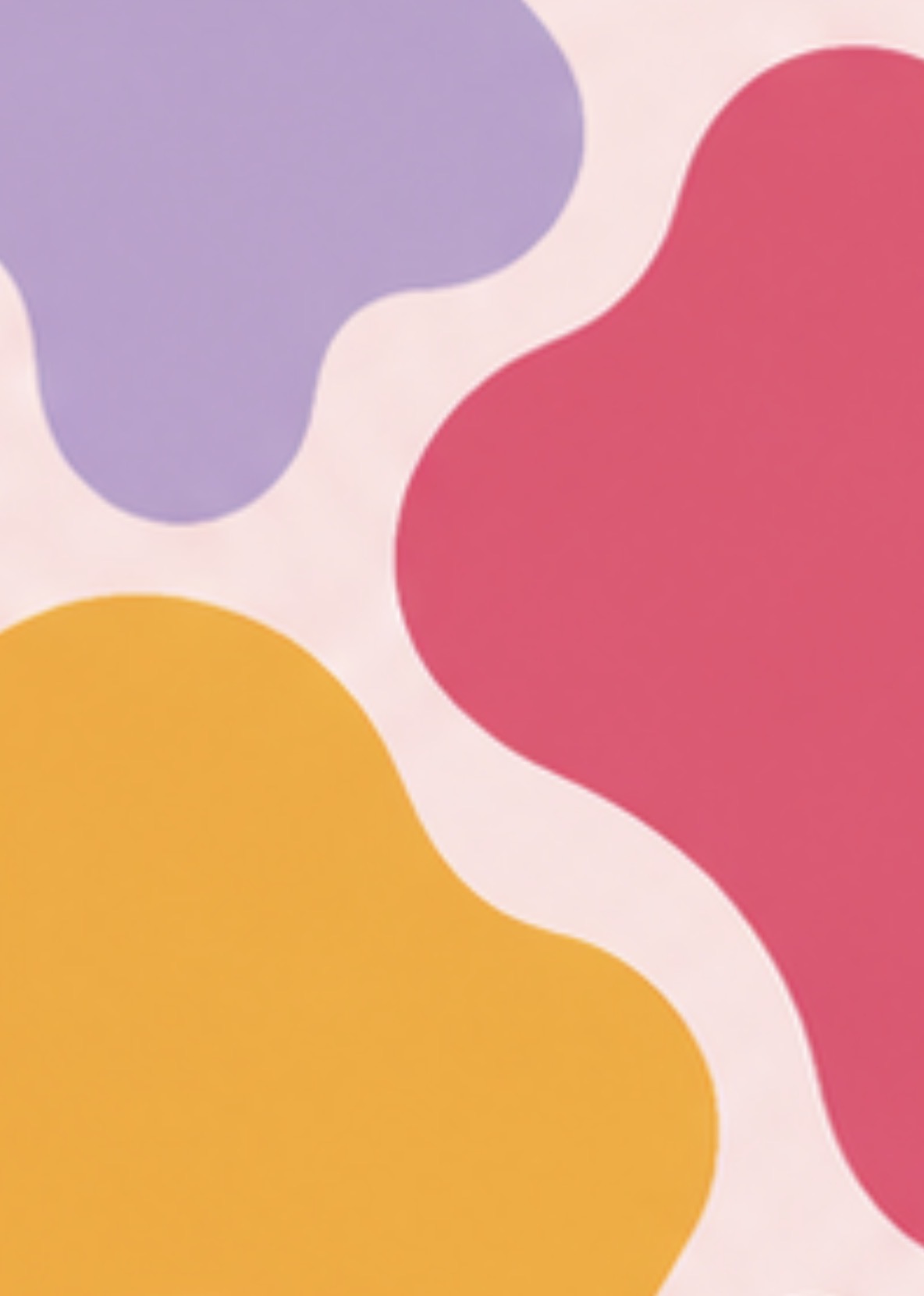
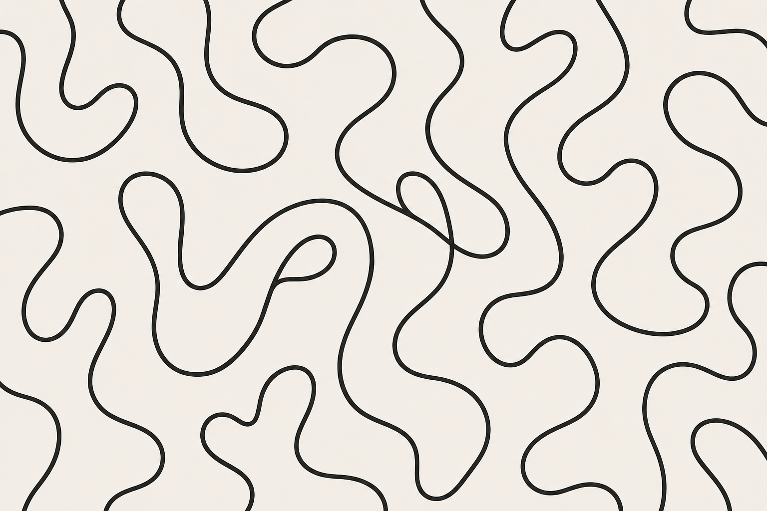
The identity leans into the feeling of arriving somewhere that already feels like yours. Coral carries the warmth and welcome, sunshine gold lights the path in, lilac and blush soften the system, and cream lets everything breathe. Squiggle line work and organic blob patterns wrap the whole brand in a quietly handmade energy — print, web, and merch all speak the same language.
02
Palette
Coral, sunshine, lilac, blush, and cream — warm welcome in five tones.
Coral
Primary warmth & welcome
#E64577
Sunshine
Light, joy, hospitality
#F4A93C
Lilac
Calm & restful accent
#B5A4D6
Blush
Soft supporting tone
#F4C8CC
Cream
Airy neutral base
#F7EFE6
Rounded Display
Wordmark & headlines
Humanist Sans Bold
Subheads & UI
Humanist Sans Regular
Body & long-form
03
Pattern library
Squiggles and blobs that wrap the brand in a quietly handmade energy.
04
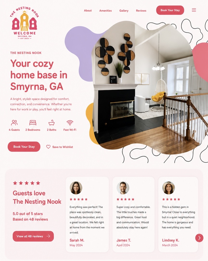
Digital presence
A homepage built for booking — warm, clear, and proof-backed.
05
Brand it, every detail
From front-door signage to guest check-in book, mug, and tote.
Deliverables
- Brand strategy & naming voice
- Rowhouse logo lockup & badge system
- Color palette with CMYK build
- Squiggle & blob pattern library
- Website concept & booking experience
- Branded guest collateral & merch
"Stay. Gather. Unwind. Where every stay feels like home."
Next