Case study · 2025
Vanessa Acosta Realtor.
An elegant bilingual real estate brand built for elevated service.
- Client
- Vanessa Acosta Realtor
- Year
- 2025
- Sector
- Real estate · Bilingual realtor
- Scope
- Brand identity · Website · Signage · Collateral
The brief
Vanessa Acosta needed a brand that felt polished, trustworthy, and personal enough to stand out in luxury-adjacent residential real estate. We built a bilingual identity system around a refined VA monogram, a grounded palette of olive, ivory, taupe, gold, and charcoal, and a full visual world that could move cleanly from web to signage to printed touchpoints.
01
Identity system
A monogram-led brand built to feel elevated and personal.
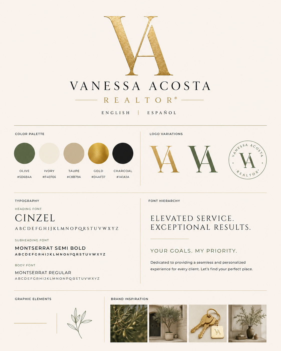
The system balances sophistication with approachability. Gold brings a sense of premium service, olive gives the brand a rooted calm, and the restrained typography keeps every application clear and confident in both English and Spanish. Rather than leaning on generic real estate cues, the work creates a more enduring presence—one that feels curated, composed, and unmistakably personal.
02
Logo exploration
Sketching toward a monogram with balance, flow, and staying power.
03
Palette & type
Olive, ivory, taupe, gold, and charcoal—quiet signals of trust.
Olive
Grounded trust
#5D6B4A
Ivory
Soft, airy base
#F4EFE6
Taupe
Neutral warmth
#C8B79A
Gold
Premium accent
#D4AF37
Charcoal
Elegant contrast
#1A1A1A
Cinzel
Headings & monogram
Montserrat Semi Bold
Subheads & navigation
Montserrat Regular
Body & support copy
04
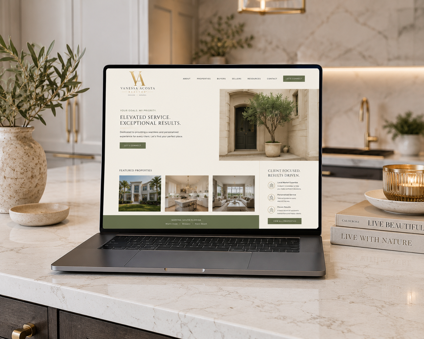
Digital presence
A homepage concept that mirrors the brand's calm confidence.
05
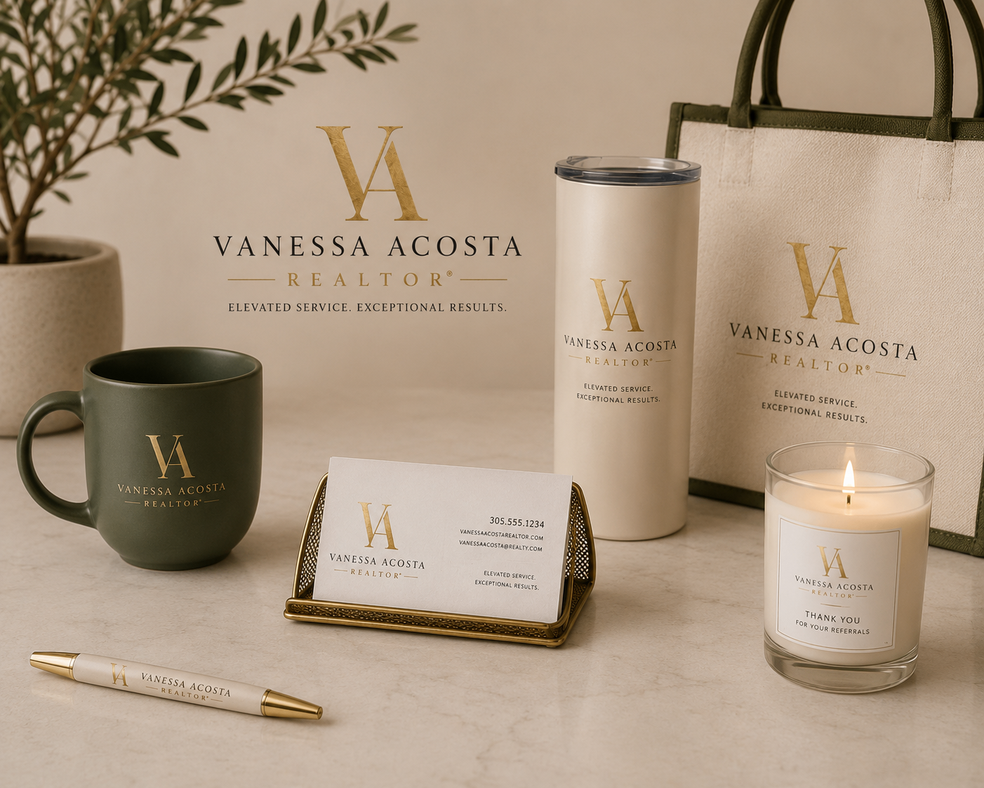
Brand extensions
Patterns, collateral, and merchandising that hold the same tone.

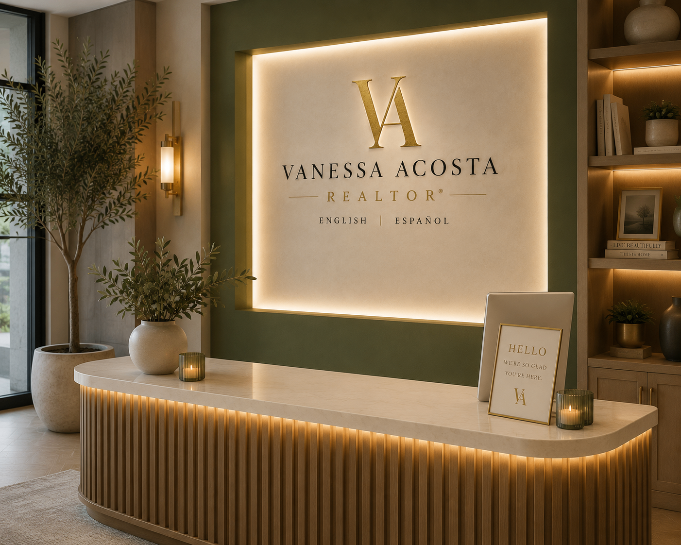
06
In-space presence
An office sign that turns the identity into an experience.
Deliverables
- Monogram and wordmark system
- Color and typography direction
- Logo exploration and refinement
- Website concept and hero imagery
- Exterior/interior signage visuals
- Pattern system and branded collateral
"Elevated service. Exceptional results."